a more intuitive way to understand numbers
Data Visualization charts are supposed to be our map of information. However, when making charts, customarily we are just re-sizing lines and circles based on metrics instead of creating a data-driven version of reality. The contemporary charting techniques have a few shortcomings (especially when dealing with high-dimensional dataset):
Context Reduction: in order to fit a high-dimensional dataset into a chart one needs to filter/ aggregate/ flatten data which results in a reduction of full context of information. Without context, most of the charts show only a part of the story, that can potentially lead to data misinterpretation/misunderstanding.
Numeric Thinking: naturally humans have hard time perceiving big numbers. While data visualization is suppose to help us to conceptualize large volumes, unless the dataset is carefully prepared, 2D charts rarely give us the intuitive grasp of magnitude.
Perceptual de-humanization: when examining charts it is easy to forget that we are dealing with activity in real world instead of lines/bars.
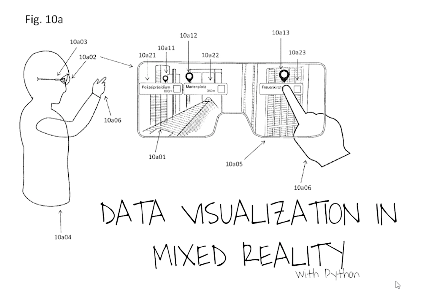
Augmented/Mixed Reality can potentially solve all of the issues listed above by presenting an intuitive and interactive environment for data exploration. Three-dimensional space provides conditions to create complex data stories with more “realistic assets” (beyond lines and bars). The talk would present the architecture required to create MR data visualization story with Python (70% of architecture), starting with drawing 3D assets in a data-driven way and finishing with deployment on MR devices.
I have presented the project at multiple conferences in 2018:
Strata Data Conference: https://conferences.oreilly.com/strata/strata-ny/public/schedule/detail/69009)
DataSciCon: https://vimeo.com/310494575)
PyCon Cleveland, OH: https://us.pycon.org/2018/speaker/profile/569/
PyCon Florence, Italy: Data Visualization in Mixed Reality with Python
